Graphs and Charts in Presentations
Types of graphs
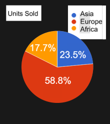
As you can see, this is ...
a pie chart.

This pie chart is ...
labeled in percentages, and shows that Europe has the biggest slice.
Here is ...
a line graph, showing that ...
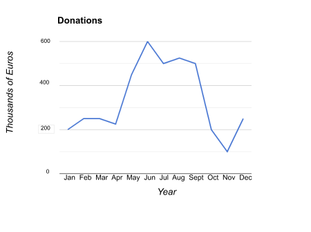
... donations climbed steadily in the spring, peaked in June, but then fell dramatically to reach a low point in November, before recovering.

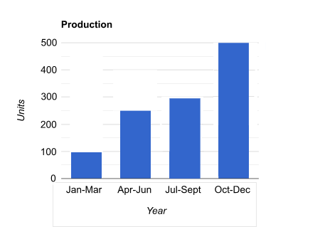
We can see from this bar chart that production increased steadily throughout the year.
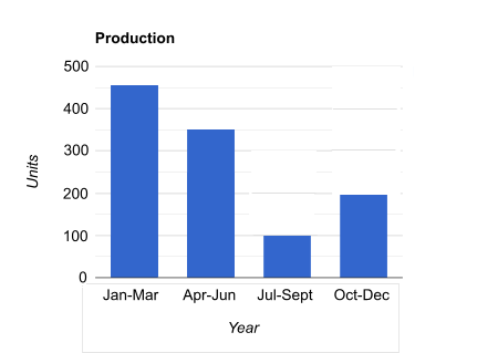
Here, however, there was a dramatic fall in the third quarter.
Of course, other basic types of graphs include ...
flowcharts, decision trees and ...
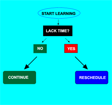
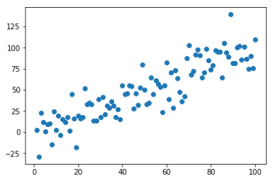
... scatter plots, etc.
Comparing Trends
Sales of BlueCorp products were relatively low at the start of the year, but shot up in April and May. They then ...
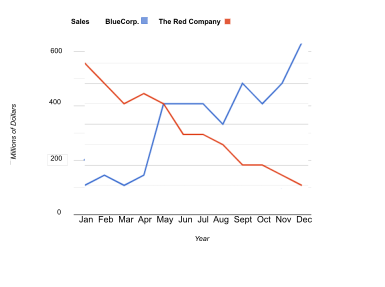
... flattened out for a couple of months, and fluctuated a little before taking off again at the end of the year. In contrast ...

... the Red Company's sales were on a constant downward trend for almost the whole year.

The language, of course, can be varied. We can say: relatively or comparatively low

We might want to say that sales ... flattened out or levelled off

Instead of 'taking off', we could use ... before going up or rising again

We can talk about ... a constant or continuous downward trend

Cause, event and effect
It is often necessary to explain why we observe something on the curve.
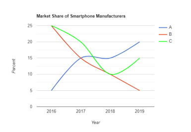
The reason for / cause of the red company's disastrous performance was its outdated technology.

The red company's slump in market share was due to / a result of its offering a dated product.

The green company's restructuring in 2018 led to / produced its recovery.

Thank you for your attention!